Home
Time Flow is a visualization tool for temporal data. It provides five display modes:
- Timeline: plots events over time on a scrollable, horizontal timeline
- Calendar: plots events by day, month, and year in calendar format
- Bar graph: a flexible, aggregate view of data points. It allows users to aggregate data by any header in the data set.
- Table: a straightforward table view of all data points
- List: a simple list of events shown on the timeline, complete with description and metadata about each data point
We currently support three data formats:
- paste from spreadsheet/HTML page
- import CSV file
- import TSV file
- text
- lists: compilations of comma-separated text values
- URLs
- numbers: European style numbers are not supported (e.g. 2,000.00 is not supported)
- dates: a variety of formats are supported (having dashes, slashes, all numbers, numbers with words in English for months, etc.) Years are always required. Hours aren’t required but, when present, are supported in a 24-hour clock. European style dates (with days before months) are not supported (e.g. 08/02/2010 is interpreted as August 2, 2010)
Limitation: if your database has more than 20,000 rows, you may run into problems. Also, once your database has more than a few thousand rows, you may experience sluggish response time.
TimeFlow supports five types of data fields:
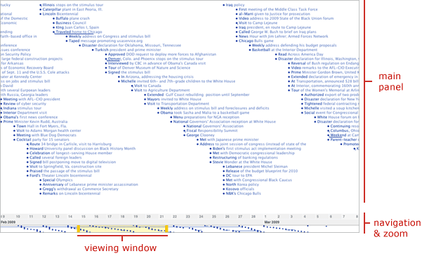
The timeline view is one of two temporal modes for visualizing data on TimeFlow (calendar is the other temporal view). The timeline shows two kinds of time-based events:
- point-in-time events: those that happen at a given moment in time, represented by a dot and a label
- date-range events: those events that have duration in time, represented by a horizontal line and label
- Double click: double clicking anywhere on the timeline canvas causes the visualization to zoom in
- Click and drag: clicking and dragging anywhere on the timeline canvas causes the timeline to focus solely on that time slice
- Navigation Bar: dragging the yellow handles on the navigation bar adjusts the viewing window, zooming in and out of the data set.
- Time Buttons: the time markers (years, months, days) at the bottom of the screen are interactive. Clicking on one of them causes the timeline to focus solely on that time slice.
- Zoom Out Button: each click on this button zooms out the data in the window twice
- Zoom Out 100% Button: clicking this button causes all of the data points to be visible in the timeline, providing the most zoomed out view in the application
- Diagonal: arranges data point from top to bottom in the order it happens, creating diagonal patterns. This mode makes it easy to understand exactly the order of events.
- Loose: the vertical location of data points is flexible. This mode makes it easy to see bursts of activity over time
- Graph: aggregates data points over time. For example, if there have been 30 events on one day and 15 the next, the first day will exhibit a bar that is twice as high as the one on the second day.
- Daily: each row represents a week, starting on Sunday and ending on Saturday.
- Monthly: each row represents a year, starting in January and ending in December
- Yearly: each row represents a decade
- Solid circle: represents a single, positive data point.
- Outlined circle: represents a single data point with negative value.
- Concentric circles: represents the aggregation of multiple data points of the same type. For example, on the First 100 Days data set, there might have been five meetings at the White House and those get shown as a single set of concentric circles of the same color. The size of the concentric circles varies depending on the number of items being aggregated.
-
Pie chart: the icon that aggregates the most data. It represents a collection of concentric circles that would have been too long to display inside a day/month/year in the calendar view. The overall area of the pie chart refers to either the number of items being aggregated or to their numeric value (in case there are numeric values in the data). Each slice represents a value in the color dimension—for example, if I’m looking at the First 100 days data set by location, each slice in a pie chart would refer to a different location.
Note: We cap the size of the pie chart so that it doesn’t spill over other cells in the calendar
The calendar has different icons for different levels of data aggregation:
- solid circle = single positive data value
- outlined circle = single negative data value
- concentric circles = multiple data points of the same type
- pie cart = compilation of multiple sets of concentric circles
Calendar Layout
- Loose: shows days/months/years at a pre-set size, where the user counts on a vertical scroll bar to navigate the data
- Compressed: compressed the size of days/month/years in an attempt to pack as much of the calendar in a single screen as possible
- Textual filters: based on data fields, allows users to filter all data points by a given category. User chooses from a menu of filter options
- Numeric: if a data field is numeric, the filter option is presented in numeric mode, showing a bar chart of the distribution of values. Dragging the ends of the bar chart causes the filter to narrow down the values being shown on the screen. The values that fall outside of the chosen range are not shown.
- Date filters: when a data field is comprised of dates, a data filter is presented, which allows users to filter values between a starting and an ending date.
Timeline Navigation
Most investigative data sets are too big to fit in a single screen, so scrolling is crucial. In TimeFlow, the timeline scrolling mechanism, located at the bottom, also functions as a zoom control.
Zooming
These are the multiple ways users can perform zooming actions in the Timeline mode of TimeFlow:
Tracks
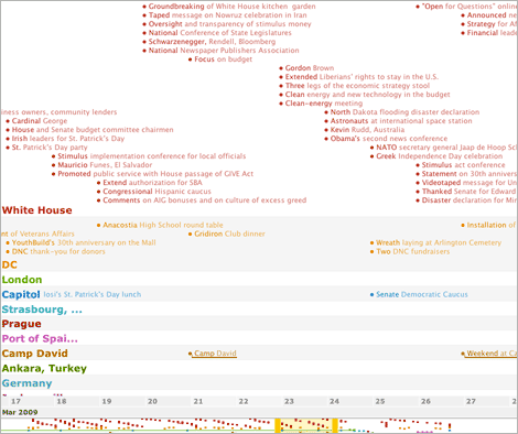
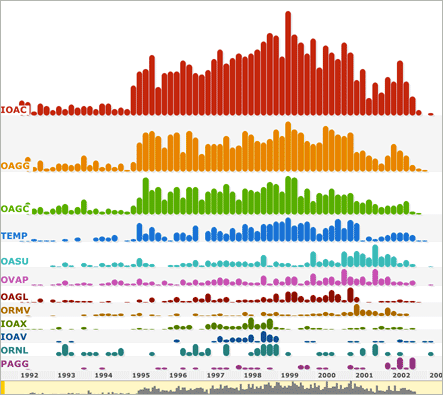
One way to unpack extra dimensions in TimeFlow is to set “tracks” in the timeline. Tracks arrange the data according to a given category. In the First 100 Days example, we could set tracks to “location” and see all the events grouped by where they happened:
Layout
By definition, a visual timeline plots data points along a time axis. However, there is more than one way to plot the points. TimeFlow offers three different layout options. These options are visible both in the visualization itself as well as one the navigation bar at the bottom of the screen.
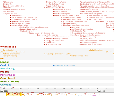
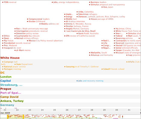
Left: diagonal layout.
Center: loose layout.
Right: graph layout.
Icons
Timeline mode can display two different icons: solid and outline circles. Solid circles represent positive values and outlined circles represent negative values.
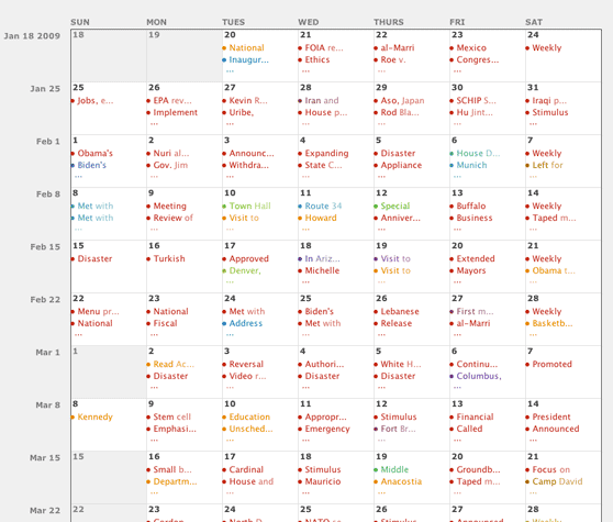
The calendar view is one of two temporal modes for visualizing data on TimeFlow (timeline being the other). The calendar provides three different modes for viewing data:
Calendar Icons (and aggregation):
There is a variety of icons that appear on the calendar view: solid, outline, and concentric circles. This diversity indicates different levels of data aggregation. The calendar aggregates data because, unlike the timeline view where users can zoom in indefinitely, this view has limited space per unit of time (day/month/year). So the icons reflect increasing levels of data compactness:
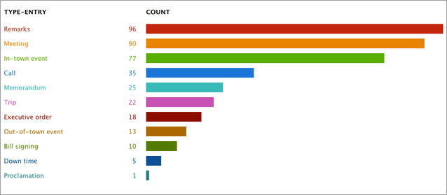
The bar chart in TimeFlow shows aggregate views of data. For example, if I’m viewing the events in the First 100 Days by type (as tracks in the timeline), this view will show me a bar chat of how many remarks, meetings, calls, trips there are in the entire data set:
Bar Chart Controls
The bar chart a flexible and powerful way of looking at all sorts of distributions in a data set. Users can choose the category by which to bin the data and the units by which to compute the bar (by amount, number of events, etc). Any of the categories that can be used as “tracks” in the timeline, can be used as bins in the bar chart.
The table mode displays a straight forward, spreadsheet-like view of the data. It also keeps the color coding used in the timeline view (in the example below, color by location had been chosen in the timeline view and it carried over to the table).
Ordering and Sorting Values
Just like a spreasheet, the table allows users to sort the data by different columns—clicking on a given header sorts the entire table in ascending order, double clicking orders values in descending order. Table results are also affected by filtering actions, not showing data that has been filtered out.
Table columns can be reordered by clicking and dragging the header cell sideways.
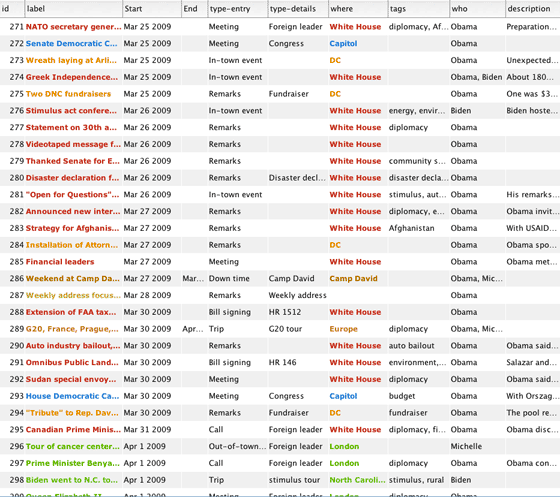
Table view.
Editing Values
Users are able to edit values directly on the table. Clicking a cell causes the editor for that cell to appear:
Editing a cell on the table view.
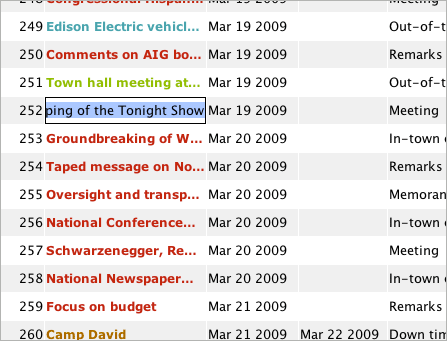
Lists all data points currently visible on the timeline. This means that the use of search and filters affect the results being shown on the list.
List view.
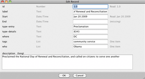
Editing
Editing of each data point is available by clicking on the “edit” link under that record’s title. The editing dialog box allows users to edit every field associated with that entry:
Editing an entry on list view.
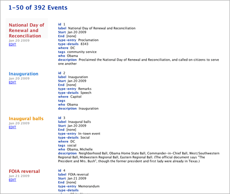
The summary lists key points and simple statistics about the data set such as the earliest and latest dates, the number of events, average of numerical values, etc. In addition, the summary also alerts about missing and blank values for each of the fields in the data set.
More than anything else, the summary is useful for getting a sense of the data overall and for finding out potential problems.
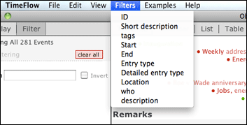
All views allow for filtering of values. Filters are global so, once a filter is set in one view, all other views will reflect the results of that action. TimeFlow provides three types of filters: search, field filters, and date filters.
Filters menu.
Search
– freeform keyword search, user types in a word into the search textfield
– regular expression search typed in the same search field
Field Filters
Note: The navigation bar is not a date filter; it only affects what’s visible on the timeline view, but doesn’t filter out values from the table, list, and calendar views.