Fix marked semitones in the piano roll #4239
Conversation
554fcbe
to
efeb0c9
Compare
efeb0c9
to
c409160
Compare
data/themes/default/style.css
Outdated
| @@ -146,7 +146,7 @@ PianoRoll { | |||
| qproperty-noteBorders: false; /* boolean property, set false to have borderless notes */ | |||
| qproperty-selectedNoteColor: #006b65; | |||
| qproperty-barColor: #078f3a; | |||
| qproperty-markedSemitoneColor: #06170E; | |||
| qproperty-markedSemitoneColor: rgba(255, 255, 255, 20); | |||
There was a problem hiding this comment.
Something like this for classic theme too?
There was a problem hiding this comment.
I always forget about that, will fix
|
Updated the classic theme, thanks @zonkmachine |

228176c
to
f5731ec
Compare
|
Classic is actually more 'visible' -but this is so easy to customize with css, so anyone can get a personal version. |
|
@musikBear I can bump up the visibility in the original theme if you want |
|
@Umcaruje Not for my sake. I have made my own version of CSS, and thats working fine for me -but its more a question what other users think. @Mark-Agent003 reacts with 👍, so i think he should chime in, and say if he feel there are visibility issues. But all that super CSS-customizing you have made possible, is a huge help! Big 👍 |
well what i did was to make my own idea, with black for marked notes, and a sea-blue for selected notes. The sea-blue is not color-blind safe, so its really only a personal choice, thats work in Rebeccas design |

|
@musikBear oh you want to influence the note color too? Sounds reasonable but also sounds like a different request entirely. I was more inviting feedback on existing feature contrast, so @Umcaruje can decide whether or not to merge this. |
|
Well from the discussion in #3651 Rebecca said that black doesn't provide enough contrast, and another thing is that black makes all the other semitones look marked even though it should be the other way around. I'll bump up the transparency the marked notes in the default theme. As far as the notes go it's the discussion for the other pull request. |
@tresf No, i just thought i might as well have both my CSS changes for piano-roll in the same picture, here the issue is the marked scale, but @Umcaruje says
So even though i find it easier to use, it is not for general usage, especially because it just as Umcaruje correctly points out, confuse new users, in respect to what is marked, and what isent marked -Eg black for marked, is contra intuitive (and should for that reason not be used :p ) |
|
I'm trying with some colour on the classic theme. Here's a comparison with lmms-1.1.3 lmms-1.1.3/classic theme lmms-1.2.0/classic theme with
|


I agree, it looks more '3D' like the note in ON the grid |
|
@musikBear @zonkmachine @tresf thanks for the feedback, this is what I came up with: |


|
The classic theme is still a bit on the dim side though. Why the change to an overlay in the first place? |
|
Its better, but its difficult to access the ergonomic effect, without working with real thing. Maby a set of css-files could be included default. Covering subtle to extreme contrast, and then users decide for them self. |
I spent a lot of time with these changes because of life getting in the way. Everything is CSS based, I changed the drawing method to an overlay here though rather than a change in the background. |
|
Well, it looks good. I think it's a merge if you're happy with it. |
I'll tackle the classic theme a bit more and then merge. |
|
Here's the classic theme, made it to be closer to 1.1.3 in terms of color contrast. |
|
Merge... |
* Fix marked semitones in the piano roll

* Don't draw in invalid patterns

* update classic theme

* Fix contrast

* update classic theme
Fixes #3651


Went with option
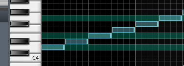
#2from the issue. @musikBear @RebeccaDeFieldScreenshots:
The marked semitones now draw over the whole grid and are a transparent overlay. This will break any existing user themes for 1.2 but it's as easy to fix as adding transparency to your color.