The goal of shinyComponents is to turn R Markdown documents in self-contained Shiny components. Like web components meets Shiny modules (without that ShadowDOM business).
You can install the released version of shinyComponents from Github.
# install.packages("remotes")
remotes::install_github("gadenbuie/shinyComponents")Writing a Shiny component often requires wiring together a number of different languages:
- R for the Shiny UI and Server pieces
- CSS or SASS for styling
- JavaScript for interactivity
- HTML dependencies for external libraries
- …and more R for data and other things.
Imagine you’ve written out all of those pieces in a R Markdown file, like the one in the details section below (click to expand).
Example R Markdown: example-component.Rmd
---
title: "Example Component"
---

```{r}
library(shiny)
initial_header <- "Just a simple demo"
```

```{ui, .tagList = TRUE, ... = list(message = "MESSAGE")}
h3(initial_header)
p(message)
sliderInput(ns("number"), "Pick a number", min = 0, max = 10, value = 1)
verbatimTextOutput(ns("debug"))
```

```{server, ... = list(times = 1)}
output$debug <- renderPrint(input$number * times)
reactive(input$number)
```

```{css}
h3 {
  color: #aaa;
}
```

```{js rewriteH3}
setTimeout(function() {
  let h3 = document.querySelector('h3')
  h3.textContent = 'Just an awesome demo'
  h3.classList = 'green'
}, 3000)
```

```{sass}
$midnight: #084C61;
$green: #629677;
body {
  color: $midnight;
}
.green {
  color: $green;
}
```
To read the component from the R Markdown, load shinyComponents and
create a new ShinyComponent.
library(shinyComponents)

ex_rmd <- system.file("example-component.Rmd", package = "shinyComponents")

ex <- ShinyComponent$new(ex_rmd)
Component documents contain {ui} and {server} chunks. That means you
can write a chunk like this
```{ui  .tagList = TRUE, ... = list(message = "MESSAGE")}
h3(initial_header)
p(message)
sliderInput("number", "Pick a number", min = 0, max = 10, value = 1)
verbatimTextOutput("debug")
```
and, because there is only one {ui} chunk, this chunk will become
available in the $ui() method.
ex$ui()<h3>Just a simple demo</h3>
<p>MESSAGE</p>
<div class="form-group shiny-input-container">
<label class="control-label" id="number-label" for="number">Pick a number</label>
<input class="js-range-slider" id="number" data-skin="shiny" data-min="0" data-max="10" data-from="1" data-step="1" data-grid="true" data-grid-num="10" data-grid-snap="false" data-prettify-separator="," data-prettify-enabled="true" data-keyboard="true" data-data-type="number"/>
</div>
<pre class="shiny-text-output noplaceholder" id="debug"></pre>
<style>body {
color: #084C61;
}
.green {
color: #629677;
}
</style>
<style>h3 {
color: #aaa;
}</style>
<script>setTimeout(function() {
let h3 = document.querySelector('h3')
h3.textContent = 'Just an awesome demo'
h3.classList = 'green'
}, 3000)</script>
Similarly, the server chunk is available in the $server() method,
for you to be call anywhere in your app’s server function. Any SASS, CSS
or JavaScript chunks are concatenated and included in appropriate
<style> and <script> tags when you call the $assets() method.
The example above hints at a number of additional features:
-
First, for simplicity, if you set
.tagList = TRUEin your{ui}chunk’s options, each expression in the chunk is added to anhtmltools::tagList(). -
Second, any plain R code chunks are treated as global code shared between the UI and Server components. In this case,
initial_headerwas set to"Just a simple demo"in a plain{r}chunk. -
Third,
{ui}and{server}components may accept inputs whose default values are set with the list provided to the...chunk option. in this case, by setting... = list(message = "MESSAGE"), we declared that the$ui()method will have amessageargument.ex$ui(message = "Hello, world!")
<h3>Just a simple demo</h3>
<p>Hello, World!</p>
<div class="form-group shiny-input-container">
  <label class="control-label" id="number-label" for="number">Pick a number</label>
  <input class="js-range-slider" id="number" data-skin="shiny" data-min="0" data-max="10" data-from="1" data-step="1" data-grid="true" data-grid-num="10" data-grid-snap="false" data-prettify-separator="," data-prettify-enabled="true" data-keyboard="true" data-data-type="number"/>
</div>
<pre class="shiny-text-output noplaceholder" id="debug"></pre>
Here’s a bare bone Shiny app incorporating all of the pieces.
library(shiny)

ex <- ShinyComponent$new(ex_rmd)

ui <- fluidPage(
  ex$ui()
)

server <- function(input, output, session) {
  ex$server()
}

shinyApp(ui, server)
Or you can run a demo app that pulls the components together into an app just like the one above.
ex$app()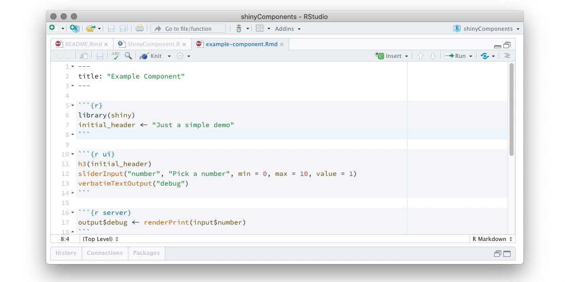
Finally, for more complex components, you may want to break your
component into smaller pieces so that you can have more control over how
and where they are used. In this case, give each {ui} or {server}
chunk a name.
# example-increment.Rmd

```{ui button}
actionButton(ns("increment"), "Plus One")
```

```{ui number}
uiOutput(ns("number"))
```

```{ui, .tagList = TRUE}
self$button()
self$number()
```

```{server}
output$number <- renderUi(span(input$number))
```
In this case, instead of a $ui() method, the Shiny Component will
contain a $ui property. That property will contain a list of three
functions:
$ui$button()from theui buttonchunk$ui$number()from theui numberchunk- and
$ui$ui()from the unnameduichunk (or theuichunk namedui).
By convention, the ui chunk can be seen as the “default” UI
arrangement. You can use this chunk to coordinate a default view of the
various pieces of the component’s UI. In situations where you want more
control over where and how the components are laid out, you can
reference each component by name, e.g. inc$ui$button() and
inc$ui$number().
Shiny Components can be Shiny Modules! You only need to do two (or maybe three) things:
-
Wrap input IDs in
ns()in youruichunks. It’s a good idea to always do this, since it won’t interfere with a component when used not as a module. -
If you want your server module to return a value, add a return value at the end of your
serverchunk (this step is optional).```{server} # ... component server logic ... reactive(input$number) ``` -
Set the
idargument when you call your$ui,$serveror$app()methods.
That’s it! Your components will automatically be modularized!
library(shiny)

inc <- ShinyComponent$new("example_increment.Rmd")

ui <- fluidPage(
  inc$ui$ui(id = "first"),
  inc$ui$ui(id = "second"),
  verbatimTextOutput("debug")
)

server <- function(input, output, session) {
  first <- inc$server(id = "first")
  second <- inc$server(id = "second")

  output$debug <- renderPrint(str(list(first = first(), second = second())))
}

shinyApp(ui, server)You can also declare dependencies for the component using the YAML
header in the R markdown document. A dependency can either be the name
of a function in a package that returns and HTML dependency — like the
rmarkdown::html_dependency_font_awesome entry below — or it can be a
list with named entries that match the arguments of
htmltool::htmlDependency().
---
dependencies:
  - rmarkdown::html_dependency_font_awesome
  - name: animate.css
    version: 4.1.1
    src:
      href: https://cdnjs.cloudflare.com/ajax/libs/animate.css/4.1.1/
    stylesheet: animate.min.css
---
These dependencies are available from the component using the
$dependencies property, and will have the name of the dependency.
By default, all declared dependencies are included with the ui()
method. Or you can include individual dependencies in the components
that require them by referencing self$dependencies$<dep name>. For
example, the button component in our previous example could rely on the
Font Awesome dependency
```{ui button, .tagList = TRUE}
actionButton(ns("increment"), "Plus One")
self$dependencies$`font-awesome`
```
or the UI returned by the server function could depend on animate.css.
```{server}
output$number <- renderUi(span(input$number, self$dependencies$animate.css))
```
Shiny Components supports turning css, sass and js chunks into CSS
or JavaScript assets. sass chunks are compiled to CSS and all assets
are in-lined using <style> or <script> tags via the $assets()
method.
Like dependencies, CSS and JavaScript assets are included by default in
the ui() method. Alternatively, you may include them manually with
self$assets() or with the $assets() method of your Shiny Component.
Currently, all CSS and JavaScript assets are returned together, but in the future we may add the ability to separate these by component piece as well.